
We’re excited to hear your project.
Let’s collaborate!

They used to be THE norm and to dictate web designers' decisions. No one questioned their usability or long-term efficiency. Or that they would soon grow into some outdated web design trends. Deprecated conventions that, when not mocked, are now regarded as mere haunting “ghost of the past”.
A “past” where glossy buttons, flashy design, and overly embellished page dividers used to steal the spotlight.
Now, let us go against today's trend of talking about “the biggest web trends in 2019” and, instead, dig out some old UI cliches. Just to determine the cause of death so that you:
Remember those “glory days” of the... flashy web? 
There was sound pretty much everywhere on a web page, animated buttons, interactive elements. And there were fancy flash menus, of course.
All web designers used to take “flashy” and “animated” for... “user engaging”.
The causes of death:
Now, let's turn back the hands of time and “freeze” it right at those days before tables stepped into the spotlight. What did we use for basic layouts back then?
We used frames...
Which are now no more than another one of the outdated web design trends that, well, it's not worth resuscitating. Back then, we didn't have JavaScript to overtake the burden of loading data, so web browsers had to do all the heavy work.
The causes of death:
OK, maybe there's no need to “mourn” over this dead UI convention, but we can't just overlook its massive contribution to... the evolution of web design.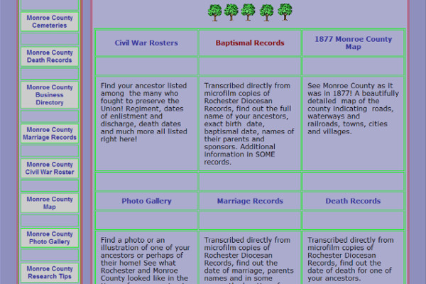
Image source: Genealogy Web Creations
Back then, when the table-based layout trend emerged and stole the spotlight, it opened a whole world of possibilities:
It empowered us to structure our web content by breaking it into multiple columns and rows.
Surprisingly enough, that mix of GIF files and inline styles did manage to glue those layouts together.
The causes of death:
The overly embellished page separators are another “once a norm, now just one of the outdated web designed trends”.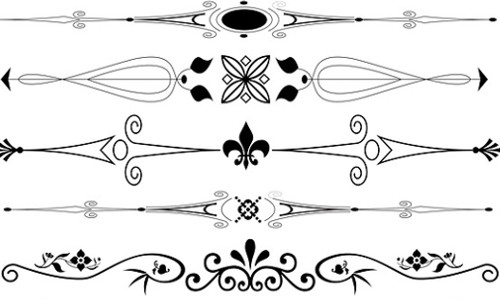
Image source: Image by Karen Arnold from Pixabay
In its “glory days,” it was our only option to split chunks of text on our web pages. And since the <hr> elements looked a bit too... dull, we went to the other extreme and started using these overly embroidered GIF separators to section our web pages.
Separators which, at first, were no more than some horizontal bars. Until web designers fell prey to the urge of gilding the lily.
The causes of death:
There was a time, way before image sliders gained their bad reputation when we would have text just... slide across web pages, from right to left.
What made this “sliding” possible? HTML's marquee tag, the equivalent of Internet Explorer's <blink> tag...
The causes of death:
Another one of those outdated web design trends dating back to early 2000, when “flashy”, “cluttered” and (most of all) “fancy” were the best adjectives to describe web designers' work.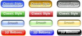
And the glossy, 3D-looking image-based buttons created in Photoshop were fancy, alright! Where do you add that they paired with custom-made, animated cursors, as well.
The causes of death:
The END!
These are the 6 most representative UI conventions for the early 2000s that have gradually turned into some outdated web design trends.
Or, better said, into “learning materials” on the old/wrong ways of designing for the web and how they influenced today's UI design best practices.
Image by Mudassar Iqbal from Pixabay

We’re excited to hear your project.
Let’s collaborate!