We’re excited to hear your project.
Let’s collaborate!

In this post, I'll share with you the top 10 rules of good UI design.
You will be learning:
Now, let's get started.
What is a good UI design?
A logical structure & necessary visual elements only.
In other words, in order to design an almost invisible user interface you need to:

Source: Medium.com
A poorly structured and cluttered UI would only make the user ask questions like: “Where's the main menu?”
And this is one of those good UI design principles that's overlooked or undermined most often.
Consistency should span over the entire ecosystem of elements that make up a UI design: fonts, colors, menus, buttons, icons.
Keeping a consistent UI throughout your website translates into creating patterns aimed at enhancing efficiency.
At improving the user experience.
And here I'm referring to layout, design, language patterns. Once the user gets familiar with a given pattern, it will be easier for him/her to interact with other parts of your website that present the same pattern.
One of the fundamental rules of good UI design is to structure your pages based on importance.
In this respect, here are the crucial principles of user interface design to guide your page layout creation:

IMAGE Image by 200 Degrees from Pixabay
Make smart use of color, texture, contrast, and light to direct the user's attention to key elements and important information on the screen.
One of the UI best practices that's both:
And it all comes down to intuitive design. To sticking to common elements when creating your user interface.
Again, the hamburger menu makes the best example: once spotted, the user knows what it is and how to open it.
Restrain yourself from showing off your creativity as a web designer. From being "discouragingly" innovative. Form should follow function, remember?
Instead of impressing your users, you should help them get things done quickly and easily.
That's what delivering a good user experience is all about, after all.
Instilling a sense of control in the user is one of the most powerful UI design principles.
Source: xd.adobe.com
In this respect, here are some specific measures that you can implement:
Ensure that the user knows, at each stage of his journey on your website, where he is, where he's been, and where he could go next.
Tip: place visual cues to help the user develop a sense of mastery and control.
Another one of those golden rules of good UI design:
Let the user know, at all times, what's the status of the process that he's initiated.
For instance, he/she might have started an action that requires some time for the computer to carry out.
In this case, make sure you provide feedback, at regular intervals, about the system status, about what's going on.
In other words, allow users to:
And this is one of the most obvious characteristics of a good UI design.
It's an easy to use interface for both casual and expert-level users.
It's more than a good UI best practice: it's a matter of... good manners to provide at least some sort of feedback at each point of action.
Therefore, make sure your system delivers a meaningful reaction each time a user:
Let the user know, using specific UI elements — animations, progress bars, pop-up windows, color change — whether he's successfully carried out the action or not.
“Task-relevant information only” should be one of your key rules of good UI design.
And sticking to a limited number of elements within the display aligns with the very limits that the human attention, itself, imposes.
In this respect, it's human nature that your users prefer to recognize information across a sequence of screens rather than to strive and recall it from their memory.
For instance, our cognitive load is always lighter when we're challenged to answer multiple-choice questions compared to having to tackle short answer questions.
And here, we go back to the “visual declutter” principle again:
Make sure that each screen supports just one single main action.
Squeezing too much information on the same screen and requesting the user to carry out more than one primary action will just:
Most likely one of the easiest to follow rules of good UI design.
Strategically use different font sizes and display text to enhance:

Photo by Alice Donovan Rouse on Unsplash
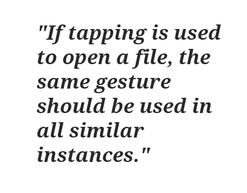
Gesturing, swiping, tapping, pressing... no need to “squeeze” all these user actions into your app. Keep them to a minimum.
Tip: Facebook and WhatsApp make some good UI design examples; their interfaces require a limited number of user gestures.
Pro tip: make sure it's crystal clear to your users what gestures they need to perform in order to carry out certain actions on your interface.
Source: Medium.com
The END!
Now, I'm really curious to hear/read your thoughts:
How does your own list of must-follow rules of good UI design look like? Have I overlooked any key best practices?
Let me know in the comments below.
Image by FiveFlowersForFamilyFirst from Pixabay

We’re excited to hear your project.
Let’s collaborate!