Mechanics Hub

Mechanics Hub is the largest recruiting company for diesel mechanics and heavy equipment technicians in North America.

But that's the short description of their activity. If we were to detail upon it, we would say that Mechanics Hub is:

  • the leading online resource in USA and Canada for Diesel machinery professionals (mechanics, technicians, parts/service staff and shop managers...) seeking jobs
  • a content-heavy, one-stop resource updated regularly with industry news, videos, tips, training resources
  • the most popular Diesel forum community
  • the go-to resource for employers looking to hire exclusively highly qualified technicians and/or skilled Diesel professionals

Now, we can all but agree that such a high trafficked website (i.e. the forum only has +10.000  active members) must provide the best user experience. Whether its visitors access it to look for job opportunities, to read the latest industry news or to hire qualified Diesel mechanics.

But user experience was precisely the aspect where, well, things could be better. And that's when we stepped in to... save the day.

The Challenge

To revamp the UI/UX design completely ...

And we knew that this was a major dare considering that:

  • we were dealing with a content-heavy website: the Mechanics Hub Toolbox alone included various content-packed subsections like the forum itself, articles, trade resources, tips & tricks, entertainment content, and the list goes on
  • the content diversity there was just ... overwhelming: pictures, articles, videos ... crosswords
  • that heavy (and complex) content infrastructure needed to be easy to access and to sift through on all devices
Job Board


In a nutshell, the 3 main goals for this project were:

  • to design a new user interface that should be cleaner, simpler, one that would enhance a smooth interaction
  • to better structure all that content on the Mechanics Hub site, making it more intuitive for users to just flow through
  • to create a cleaner and more modern website design that should better reflect the Mechanics Hub brand identity
What We Did

Migrated the Website from Wordpress to Drupal

And this called for a complex, multi-step process, where we implemented content and assets migration from one platform to the other.


Simplified the Content Structure

We knew that reorganizing the content architecture so that it should be simpler and easier to follow was crucial if we wanted to improve the user experience on the website.

And this was definitely no easy task, but we managed to come up with a more solid, more logical structure for this content-rich website.

One that ensures a simplified, more intuitive navigation for its visitors.


Redesigned the MechanicsHub Website

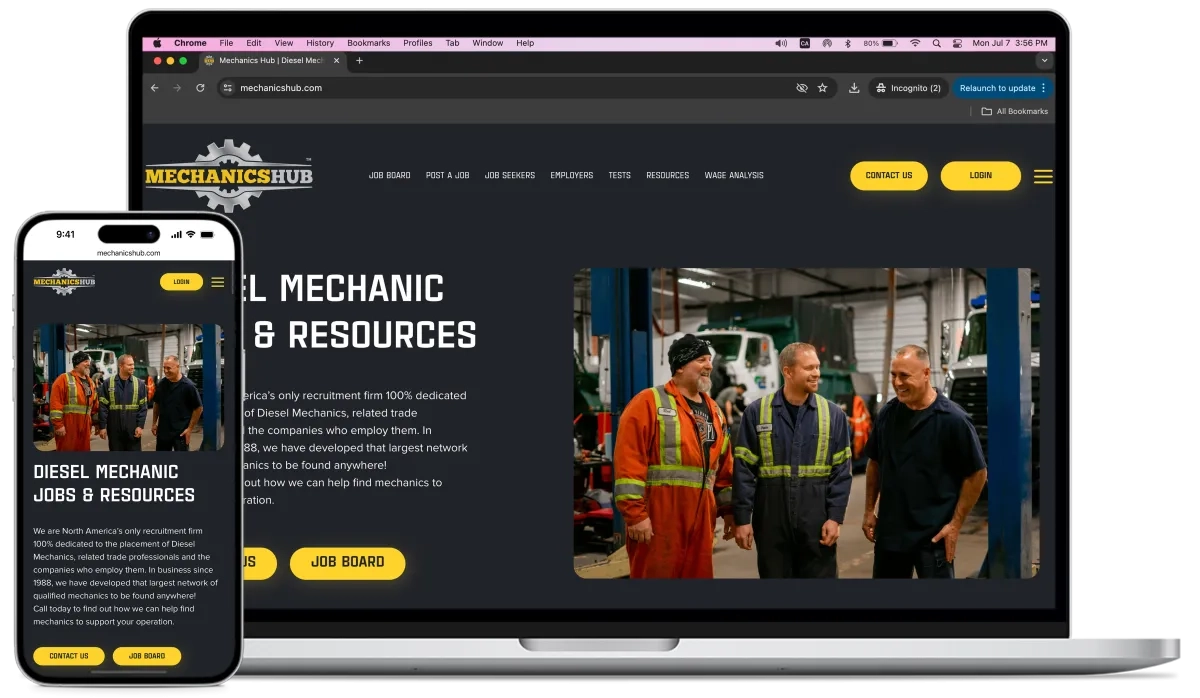
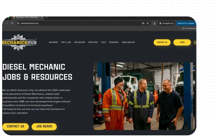
And here we played with color contrasts: black and yellow.

Black was already the dominant color on the existing site and we added splashes of bright yellow, the same hue that you can find in their logo, to:

  • reinforce their brand identity aesthetically
  • draw attention to specific pieces of content on the website, leveraging this powerful contrast, and better guide the visitors to the key sections there

Overall, besides this strategic use of color contrast, our team strived to give the site's old design a cleaner, simpler look. To bring it up to date with the latest web standards.

Mechanics Forum


Implemented Responsive Web Design

Again, ensuring that this heavy (and heavily diversified) content ecosystem was easy to navigate no matter the screen size, was a real "struggle" for our web designers.

Yet, we managed to make the content interface easy to navigate and user-friendly on all devices.

Tips & Tricks


The Result

Mechanics Hub has gone from a clunky, overly cluttered and somehow too distracting WordPress site, to a:

  • visually-pleasing
  • inviting
  • neatly and logically structured


... Drupal website with a simplified and more intuitive navigation and cleaner design.

Browse cities